UX Strategy
Transforming the traveler experience: Redesigning Civitatis for the future
A comprehensive UX strategy to modernize a tourism platform with 2016-era design, driven by behavioral psychology, competitive intelligence, and real user data.

Improve user trust in the brand and user satisfaction with the product
The Civitatis website, designed in 2016, had not evolved with user expectations, technology, or market competition. As Product Design Lead, I led the strategic redesign to transform the entire traveler experience across all channels.
A platform stuck in 2016
The existing design didn't account for the needs, concerns, and behavior of modern users, the growth of the company, or the latest industry trends. Through deep analysis, I identified four critical issues:
Outdated design
A 2016 design that didn't account for user needs, company growth, or the latest trends in travel UX.
Technical debt
Large legacy codebase preventing advancement of new developments and business growth.
Brand inconsistency
Inconsistent brand image and components across website, apps, guides, B2B panels, and supply panels.
Communication gaps
Inconsistent messaging across channels, with no omnichannel strategy connecting the user journey.
This case study is password-protected.
Surface symptoms
- Low mobile conversion
- Payment friction
- Clarity complaints
- Cross-device drop-off
Behavioral friction
- Cognitive overload
- Purchase anxiety
- Trust gaps
- Context loss
Structural root cause
Design not systematically reducing uncertainty.
Rather than redesigning isolated screens, the initiative reframed the problem as systemic uncertainty across the journey.
Surface symptoms — low mobile conversion, payment friction, cross-device drop-off — traced to a single structural root cause: design not systematically reducing uncertainty. Rather than redesigning isolated screens, the initiative reframed the problem as systemic.
The response was a 3-pillar transformation framework: Brilliant Basics (clarity before aesthetics), Search as Confidence Engine (find it fast, trust the result), and Omnichannel Continuity (your journey follows you across every device).
Brilliant Basics
Clarity before aesthetics.
- Immediate page purpose
- Strong hierarchy
- Reduced cognitive load
- Scannable structure
Search as Confidence Engine
Find it fast, trust the result.
- Early autocomplete
- Error tolerance
- Reduced steps
- Unified interaction model
Omnichannel Continuity
Your journey follows you.
- Saved searches
- Wishlist persistence
- Cart continuity
- Cross-session state
Behavioral design as the backbone
I grounded the entire redesign strategy in behavioral psychology — understanding how cognitive biases, mental shortcuts, and social influence shape every purchasing decision.
Reducing uncertainty
A person who is not 100% sure will not buy. When users feel uncertainty, they either postpone the decision or abandon the purchase altogether. Every design decision was made to reduce doubt and build confidence at each step of the journey.
The approach
Define the desired user behavior. Map the path to achieve it. Detect and remove barriers. Adapt to user abilities and limitations. Leverage social context and peer interactions to reinforce decisions.
Discovery
Evaluation
Commitment
Payment
Each stage of the journey was intentionally supported by behavioral levers to increase confidence and reduce hesitation.
The entire strategy was grounded in behavioral psychology. A person who is not 100% sure will not buy. Each stage of the journey was supported by specific levers: anchoring and category framing at discovery, social proof and scannability at evaluation, free-cancellation emphasis at commitment, security reassurance at payment.
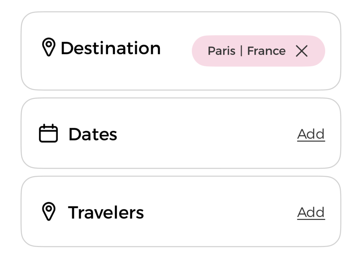
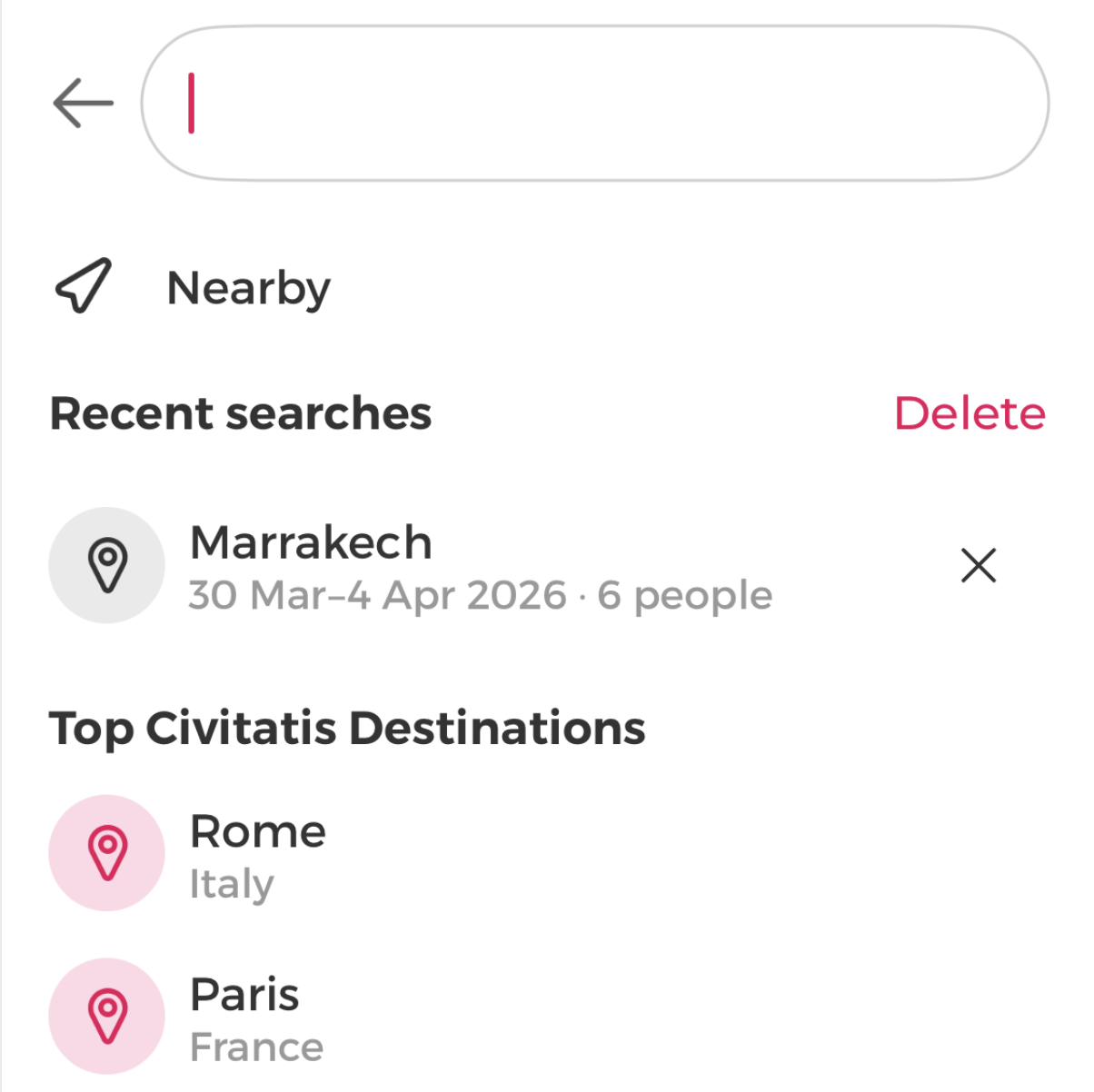
Connecting the traveler's journey across every device
Most visits come from mobile, but most conversions happen on desktop. The gap between these channels represented massive lost revenue. Users start searching in micro-moments — waiting for the subway, in a queue — and are constantly interrupted. Their searches, wishlists, and carts must follow them across devices.
The data
71.60% of traffic is mobile. 29% of all desktop sales in Spain are preceded by clicks on a mobile device. Smartphones peak at 6-8 AM, desktops during work hours, tablets at 9-11 PM.
The insight
75%+ of users say consistent experiences across channels make them more likely to do business with a brand. 46% of companies consider their omnichannel maturity low or nil — a competitive opportunity.
71.6% of traffic is mobile, but most conversions happen on desktop — users start on mobile and finish on desktop. Searches, wishlists, and carts must persist across every device. With 75%+ of users saying cross-device consistency increases their likelihood to convert, and 46% of companies at low omnichannel maturity, continuity was both a user need and a competitive gap.
What users were telling us
NPS analysis over the previous 90 days provided hard data confirming the audit findings. The numbers pointed clearly to the areas requiring immediate attention.
General UX issues
Payment problems
Unclear information
Page speed & usability
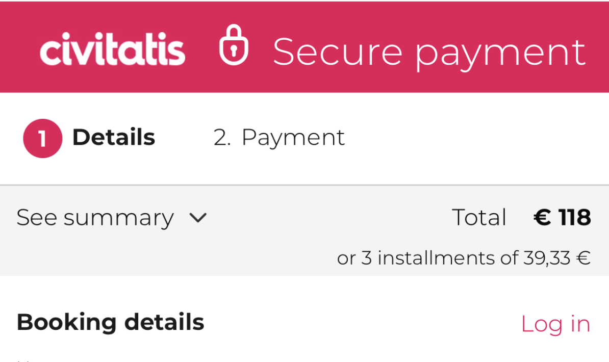
Payment problems (21.7%)
Technical failures preventing transactions, user concerns about providing credit card data (especially for free tours), and requests for more payment methods like Apple Pay and Google Pay.
Unclear information (12.1%)
Users confused about pickup locations, activity details and inclusions, and price discrepancies between what was advertised and the final checkout total.
Page speed & usability (11.0%)
Slow page loading times and navigation difficulties including finding relevant information and completing the booking process.
14% of all users reported unclear information and payment issues. On desktop specifically, 21% had payment problems and 18% found information unclear. These weren't minor complaints — they were conversion killers.

Inspiring first impression
Aspirational branding with real photos, clear value proposition, categorized content, and personalization from the first visit.
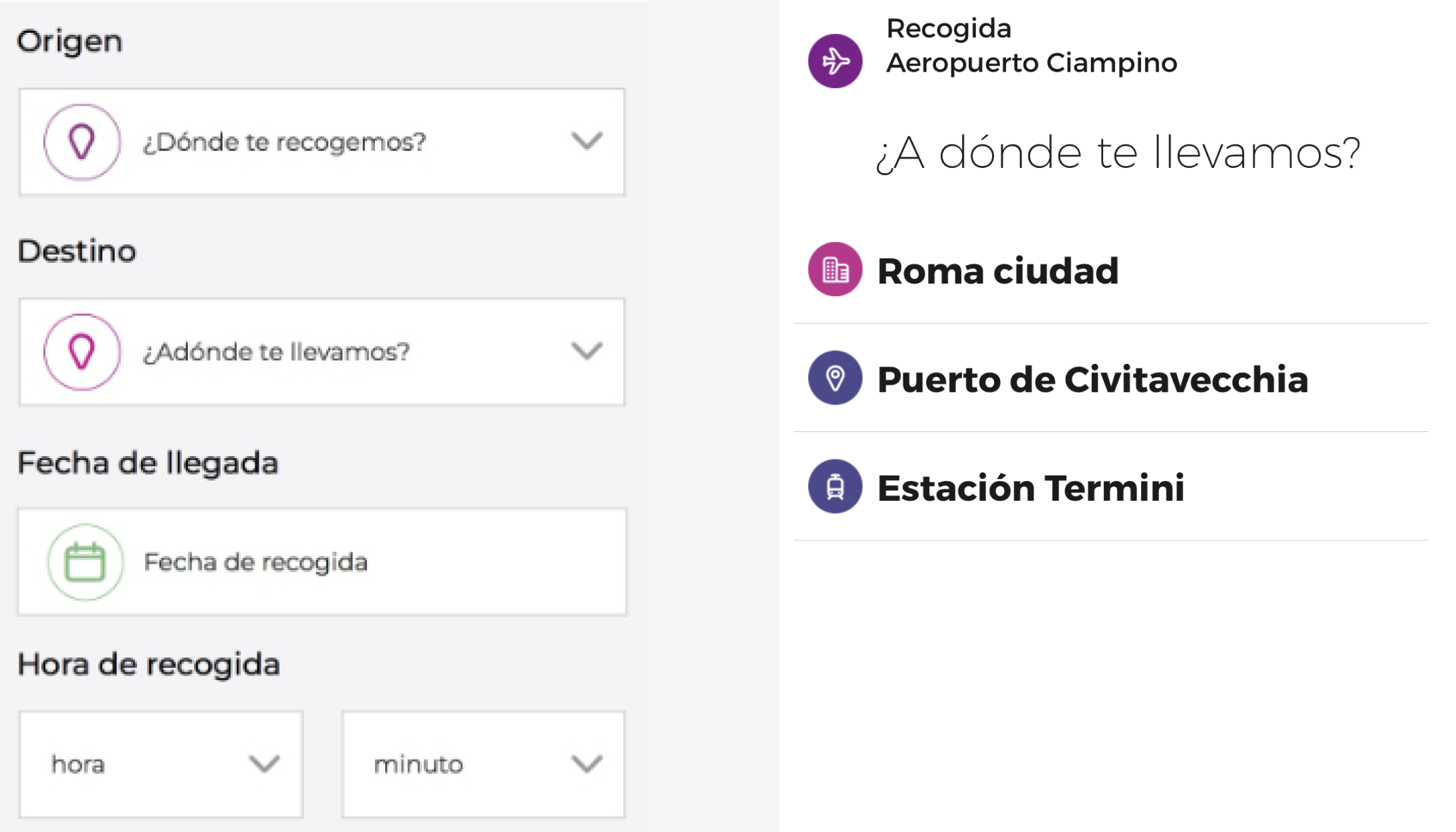
Smart search
1-character results, date filtering, omnichannel sync, spelling correction, and persistent search during scroll.
Reduce uncertainty
Free cancellation visible everywhere, itinerary maps, clear pricing, activity details at a glance, "know before you go" sections.
Behavioral design patterns
Social proof, loss aversion, anchoring, low commitment options, anticipation at every decision point in the funnel.
Connected channels
Synced searches, wishlists, and carts across web, app, and all touchpoints. Consistent UI/UX and brand identity everywhere.
Trust & confidence
External review validation, secure payment messaging, explain every form field, Apple Pay / Google Pay integration.
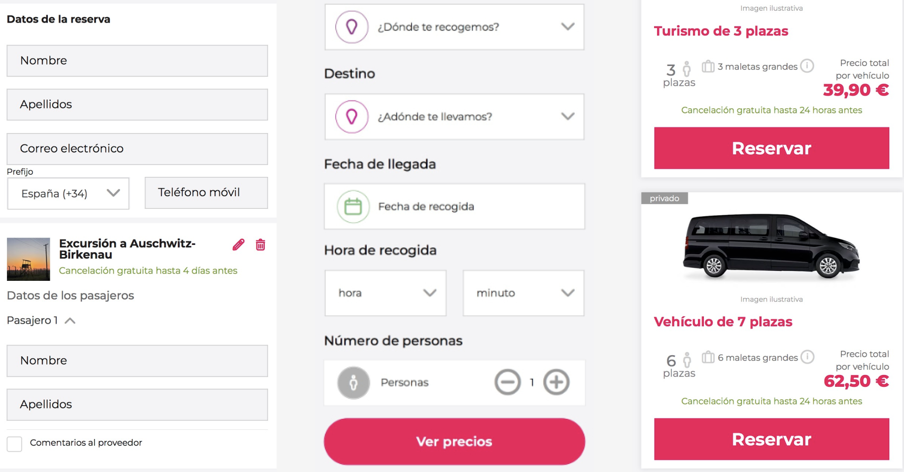
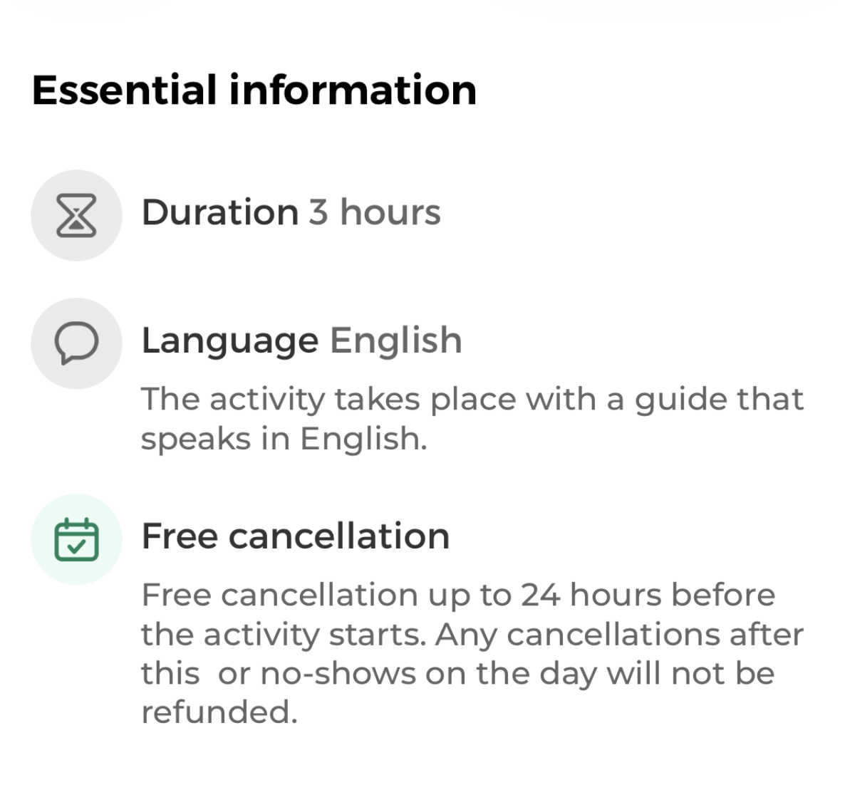
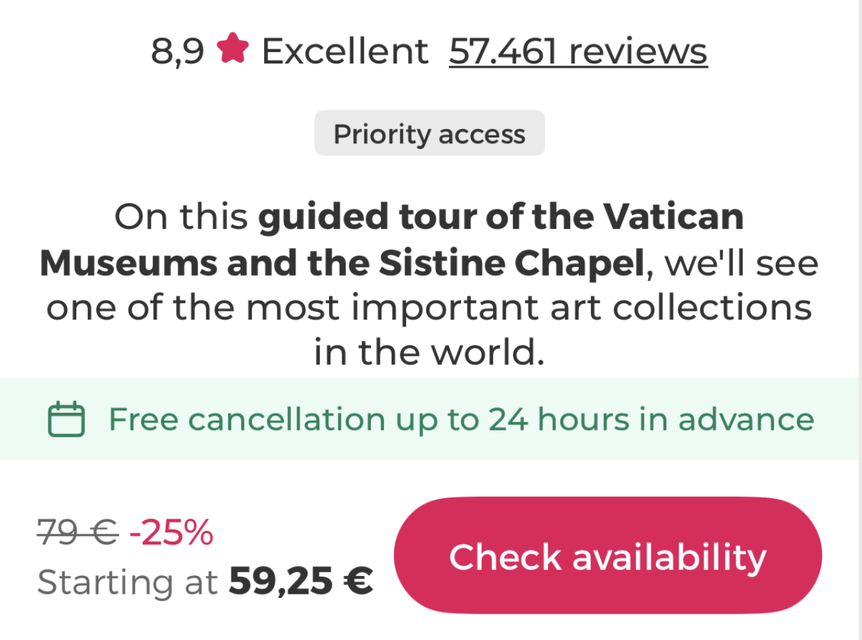
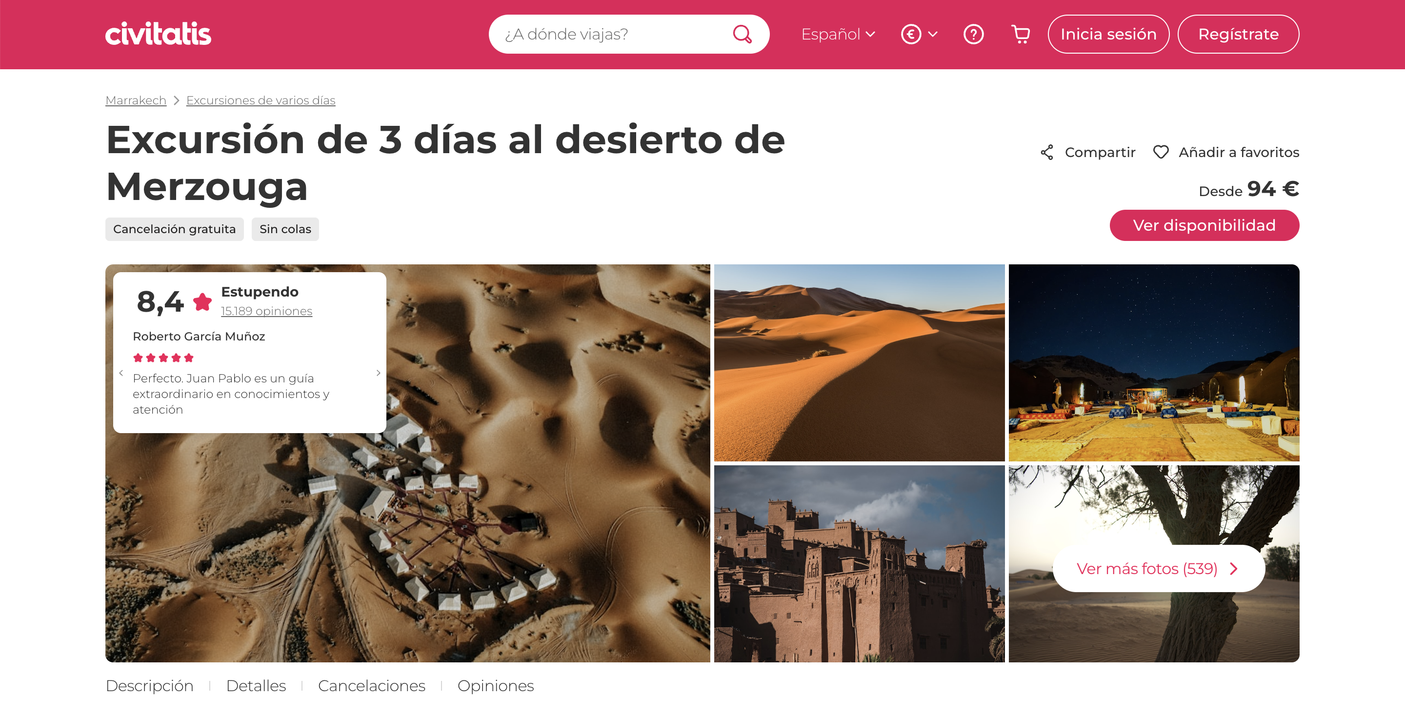
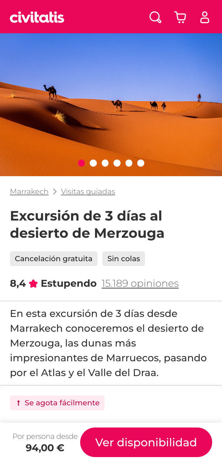
Product detail page redesign
The product detail page was the first tangible output of the strategy. The redesign focused on three core objectives: inform with clear, structured content about the activity, show availability with transparent pricing and scheduling, and enable booking with reduced friction and increased confidence.
Key decisions
- Product overview: restructured to surface the most critical information above the fold — rating, duration, free cancellation, and price.
- Mini description: a concise summary replacing long-form text, designed for scannability on mobile.
- Information architecture: reorganized content into clear sections — what's included, itinerary, meeting point, know before you go.
- Behavioral mapping: social proof, urgency signals, and trust indicators placed at key decision points throughout the page.
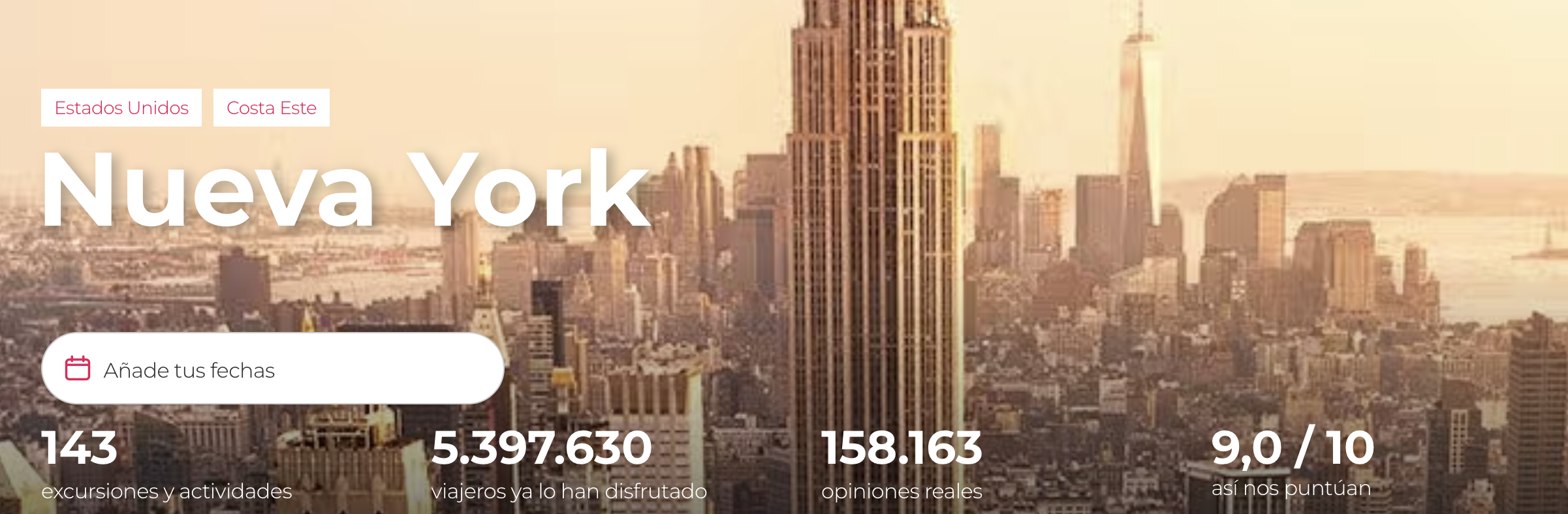
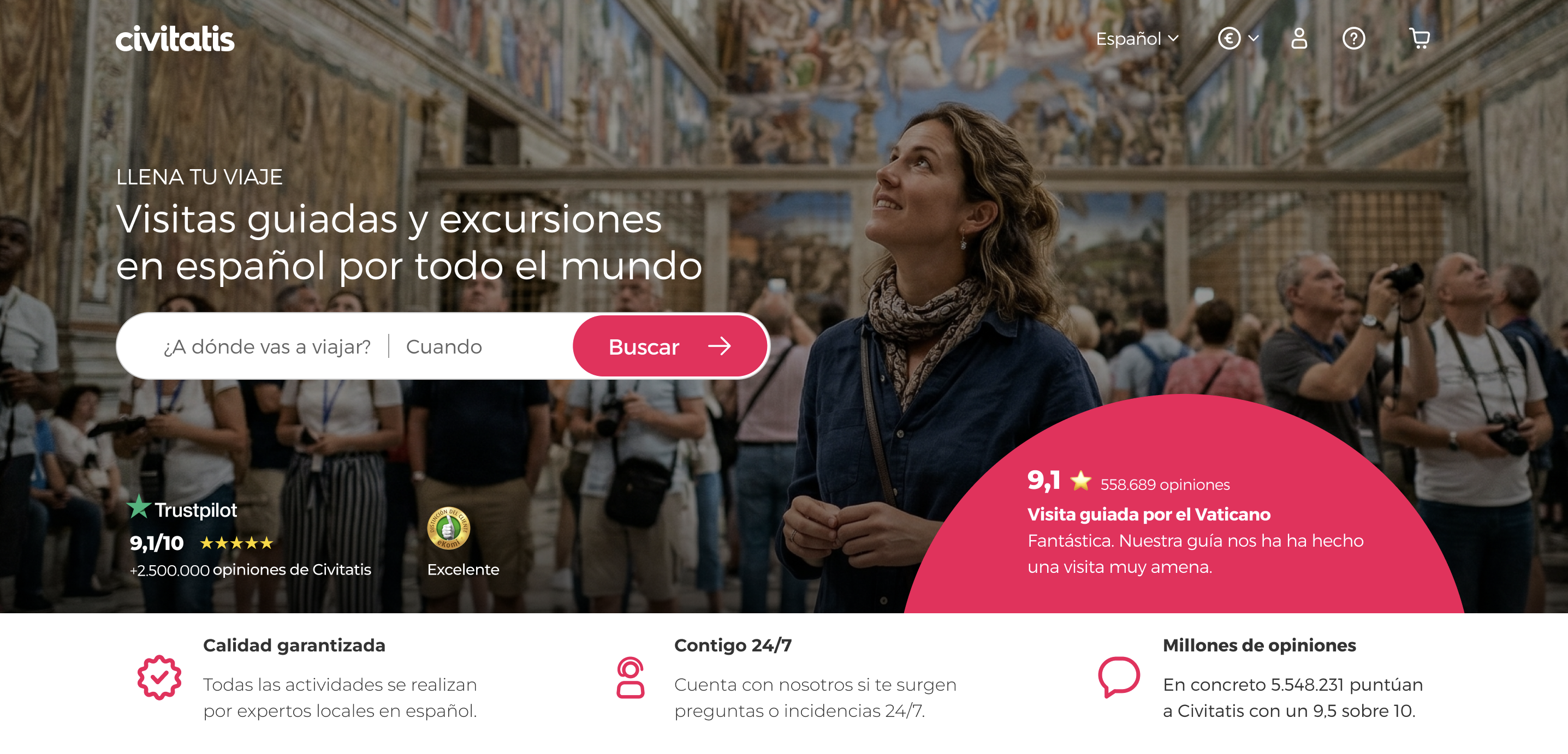
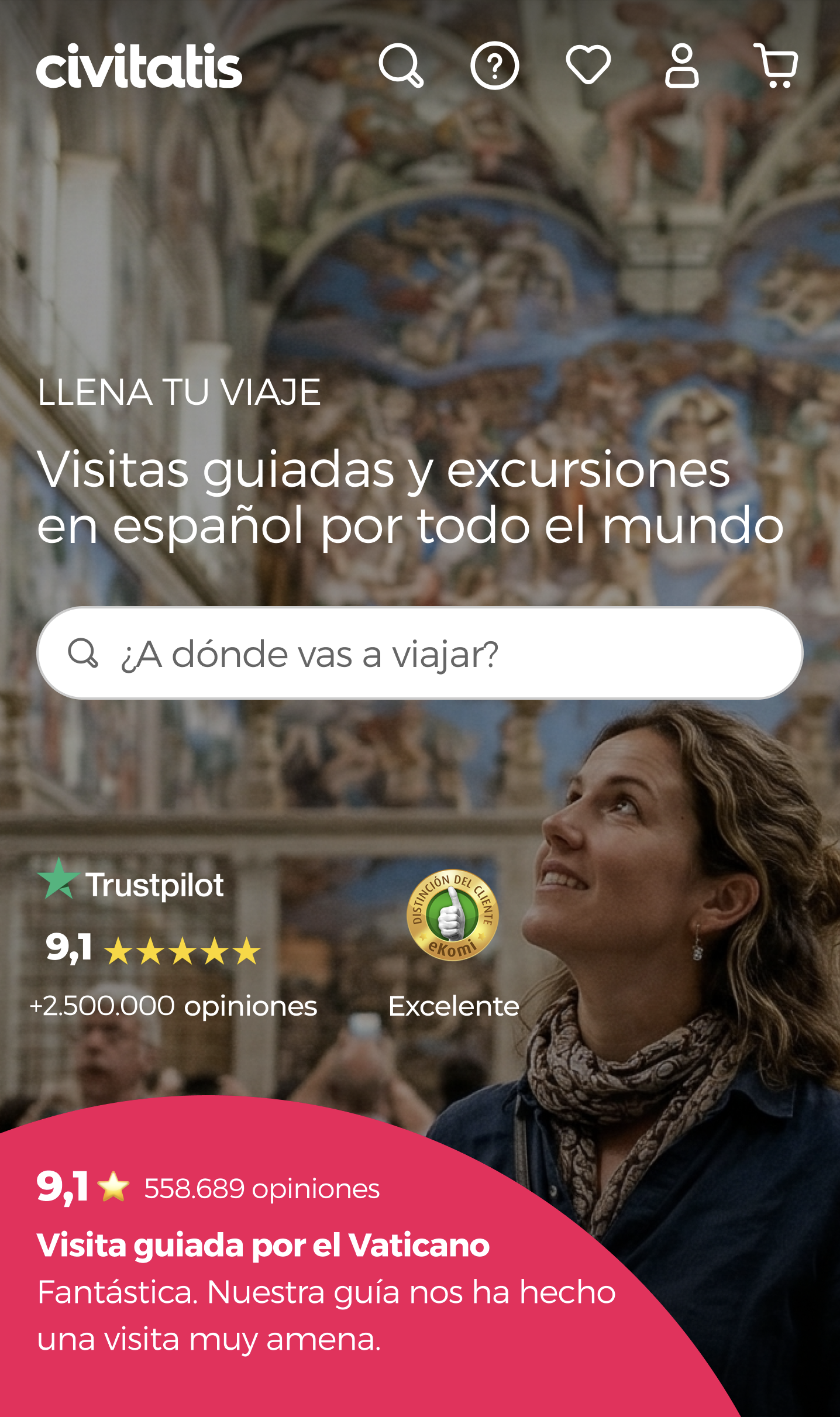
Home page redesign
It needed to accomplish four objectives: enable discovery with a mobile-first approach, inspire with aspirational imagery and real photography, create a modular structure that could adapt to different user segments, and reduce cognitive load with clear hierarchy and scannable content.
Get in touch
Let's talk.
Open to new opportunities. Based in Madrid, working globally.