hero · ux strategy
Reducing uncertainty across a high-traffic booking experience
How I diagnosed systemic UX problems on a platform unchanged since 2016, built a behavioral framework from NPS and session data, and redesigned the PDP, Home, and Checkout to reduce friction across the booking journey at Civitatis.
specs
hero-visual

context
Civitatis is one of the largest travel activity platforms in the Spanish-speaking market, but the website hadn't been meaningfully redesigned since 2016. The interface didn't reflect how modern users browse, evaluate, and book experiences, and the gap was visible in NPS complaints, behavioral data, and a growing disconnect between mobile traffic and desktop conversion. I set out to diagnose the root problems, build a shared framework for the redesign, and design the key pages that would define the new experience.
My approach: treat uncertainty as the core design problem. A person who is not 100% sure will not buy, every design decision should reduce doubt and build confidence.
context
Civitatis hadn't been meaningfully redesigned since 2016, and the gap showed in NPS complaints and mobile behavior. I set out to diagnose the root problems and redesign the key pages, treating uncertainty as the core design problem: a person who is not 100% sure will not buy.
my-role
As Principal Product Designer IC, I owned:
- Behavioral analysis, synthesizing ContentSquare, GA, and NPS data to identify where and why users dropped off
- Framework definition, creating the "reduce uncertainty" lens that grounded every design decision in behavioral psychology
- Design execution, information architecture, interaction patterns, and visual hierarchy for PDP, Home, and Checkout, from wireframes to final UI
- Cross-functional alignment, working with PMs, engineers, and stakeholders to prioritize what to build
- User data synthesis, translating NPS verbatims and session recordings into actionable design direction
my-role
As Principal Product Designer IC, I owned the behavioral analysis (ContentSquare, GA, NPS data) and defined the "reduce uncertainty" framework that grounded every design decision. I designed information architecture and visual hierarchy for PDP, Home, and Checkout, working cross-functionally to prioritize what to build.
the-problem
A platform stuck in 2016
Through deep analysis of behavioral data, NPS verbatims, and competitive benchmarks, I identified four critical issues that were compounding into a systemic trust and usability problem:
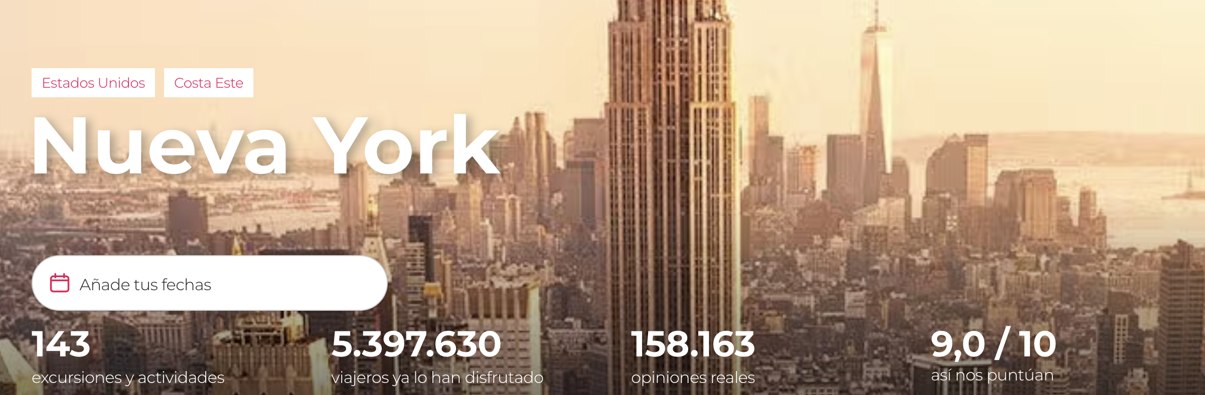
Outdated design
A 2016 design that didn't account for user needs, company growth, or the latest trends in travel UX.
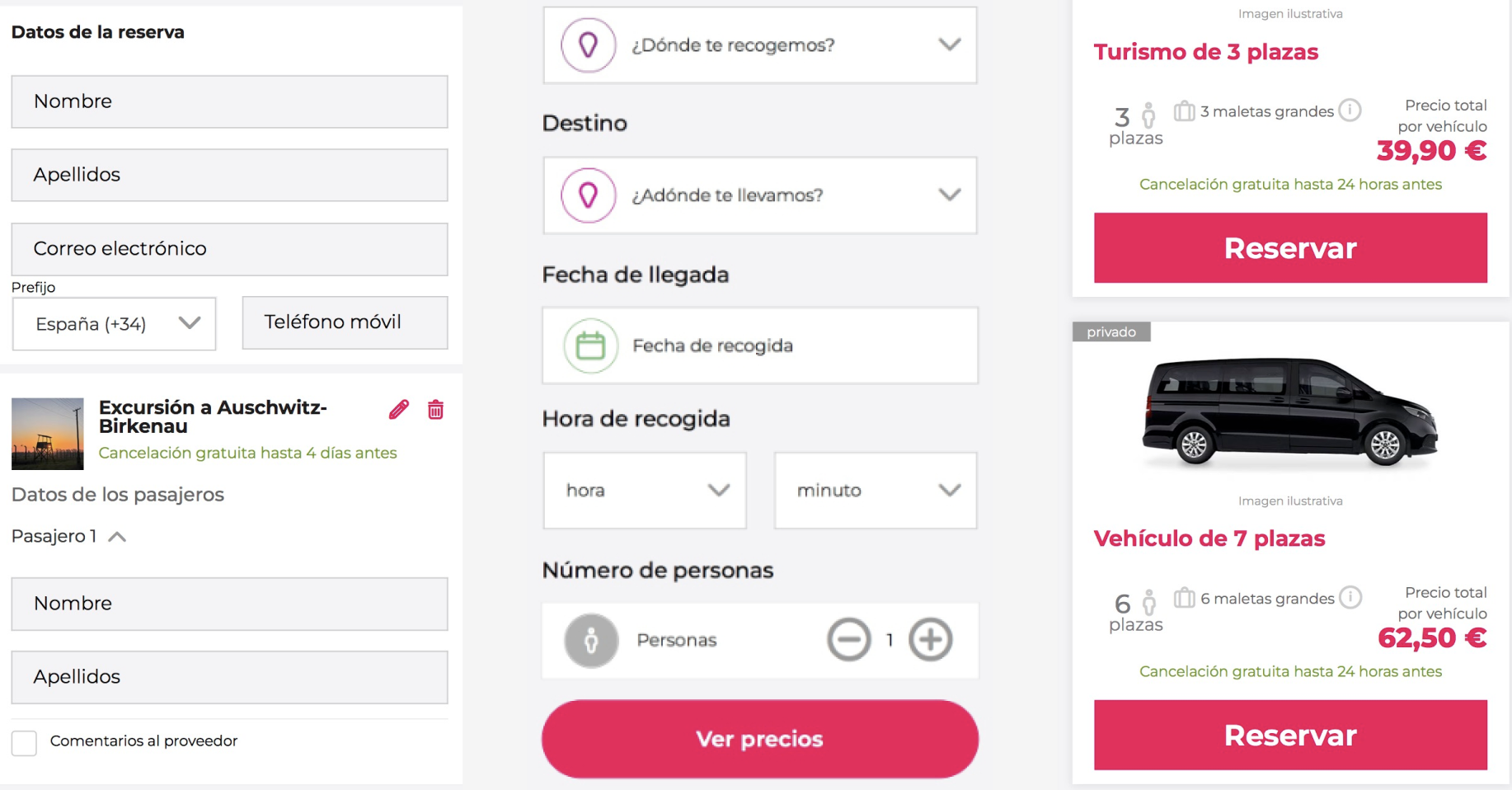
Technical debt
A legacy codebase where every UI change was expensive, inconsistencies accumulated because fixing them was never prioritized.
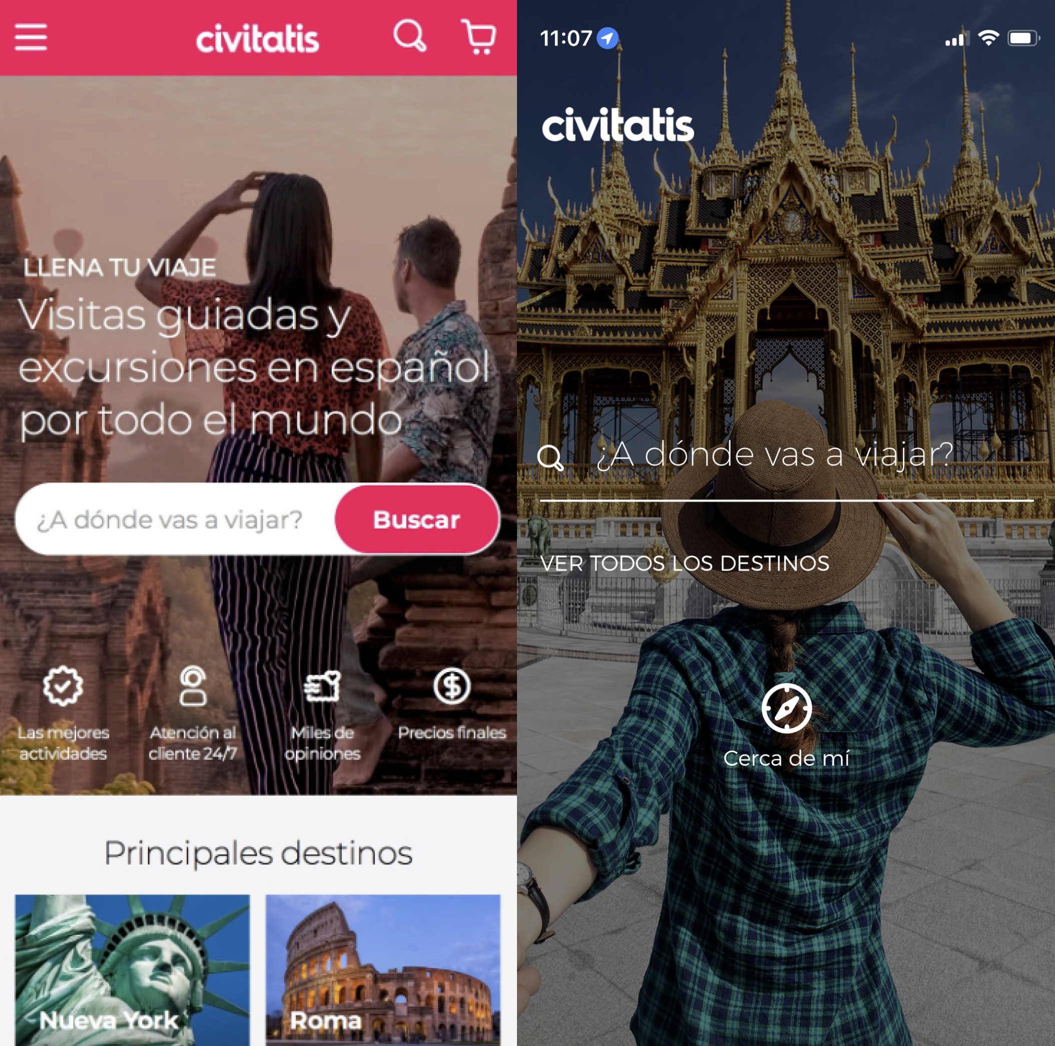
Brand inconsistency
Inconsistent brand image and components across website, apps, guides, B2B panels, and supply panels.
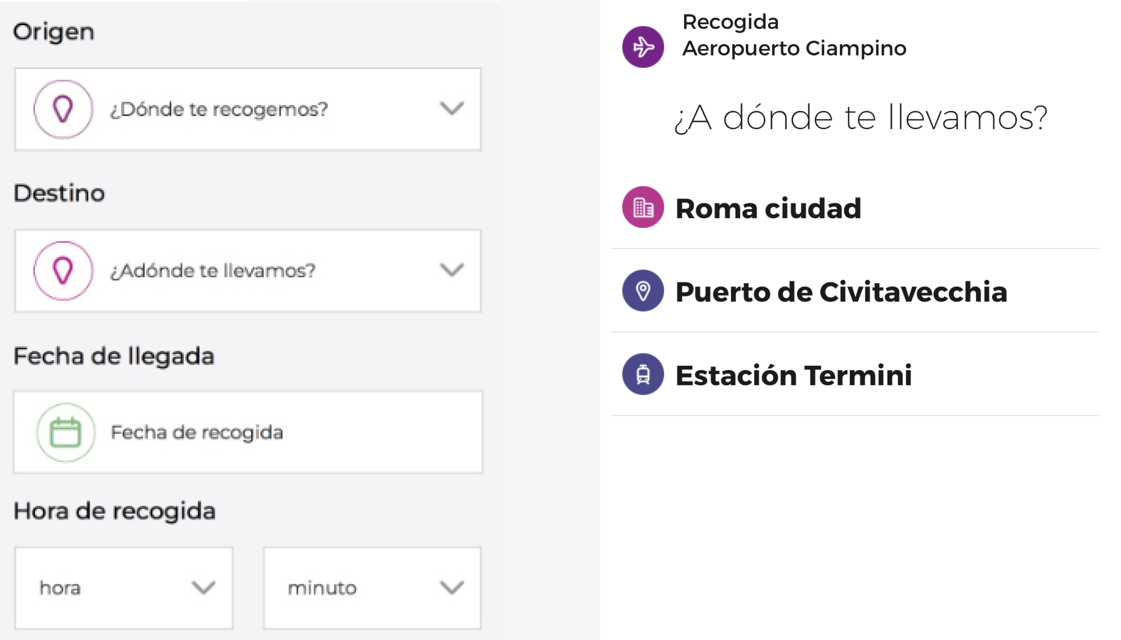
Communication gaps
Inconsistent messaging and visual language across the pages of the booking journey, each step felt like a different product.
the-problem
A platform stuck in 2016
Behavioral data, NPS verbatims, and competitive benchmarks pointed to four compounding issues: an outdated 2016 design, expensive-to-change technical debt, brand inconsistency across platforms, and a booking journey where each step felt like a different product.
root-cause
Designing for cognitive safety
Surface symptoms
- Low mobile conversion
- Payment friction
- Clarity complaints
- Cross-device drop-off
Behavioral friction
- Cognitive overload
- Purchase anxiety
- Trust gaps
- Context loss
Structural root cause
Design not systematically reducing uncertainty.
root-cause
Surface symptoms, low mobile conversion, payment friction, cross-device drop-off, traced to a single structural root cause: design not systematically reducing uncertainty. Rather than redesigning isolated screens, I reframed the problem as systemic: every touchpoint needed to actively reduce doubt and build user confidence.
user-data
What users were telling us
NPS analysis over the previous 90 days provided hard data confirming what the competitive benchmarks had suggested. The numbers pointed clearly to the areas requiring immediate attention.
Payment problems (21.7%)
Technical failures preventing transactions, user concerns about providing credit card data (especially for free tours), and requests for more payment methods like Apple Pay and Google Pay.
Unclear information (12.1%)
Users confused about pickup locations, activity details and inclusions, and price discrepancies between what was advertised and the final checkout total.
Page speed & usability (11.0%)
Slow page loading times and navigation difficulties including finding relevant information and completing the booking process.
Payment problems (21.7% of complaints) and unclear information (12.1%) dominated the negative feedback. Of desktop complaints specifically, 21% cited payment problems and 18% unclear information. These weren't edge cases, they were conversion killers.
user-data
NPS analysis over 90 days confirmed the diagnosis: 51.9% of complaints were general UX issues, 21.7% payment problems, 12.1% unclear information. Of desktop complaints, 21% cited payment problems and 18% unclear information, these were conversion killers, not minor complaints.
design-work-intro
Three pages carried most of the journey's uncertainty: the product detail page, the home, and checkout.
pdp
Product detail page
What the data showed
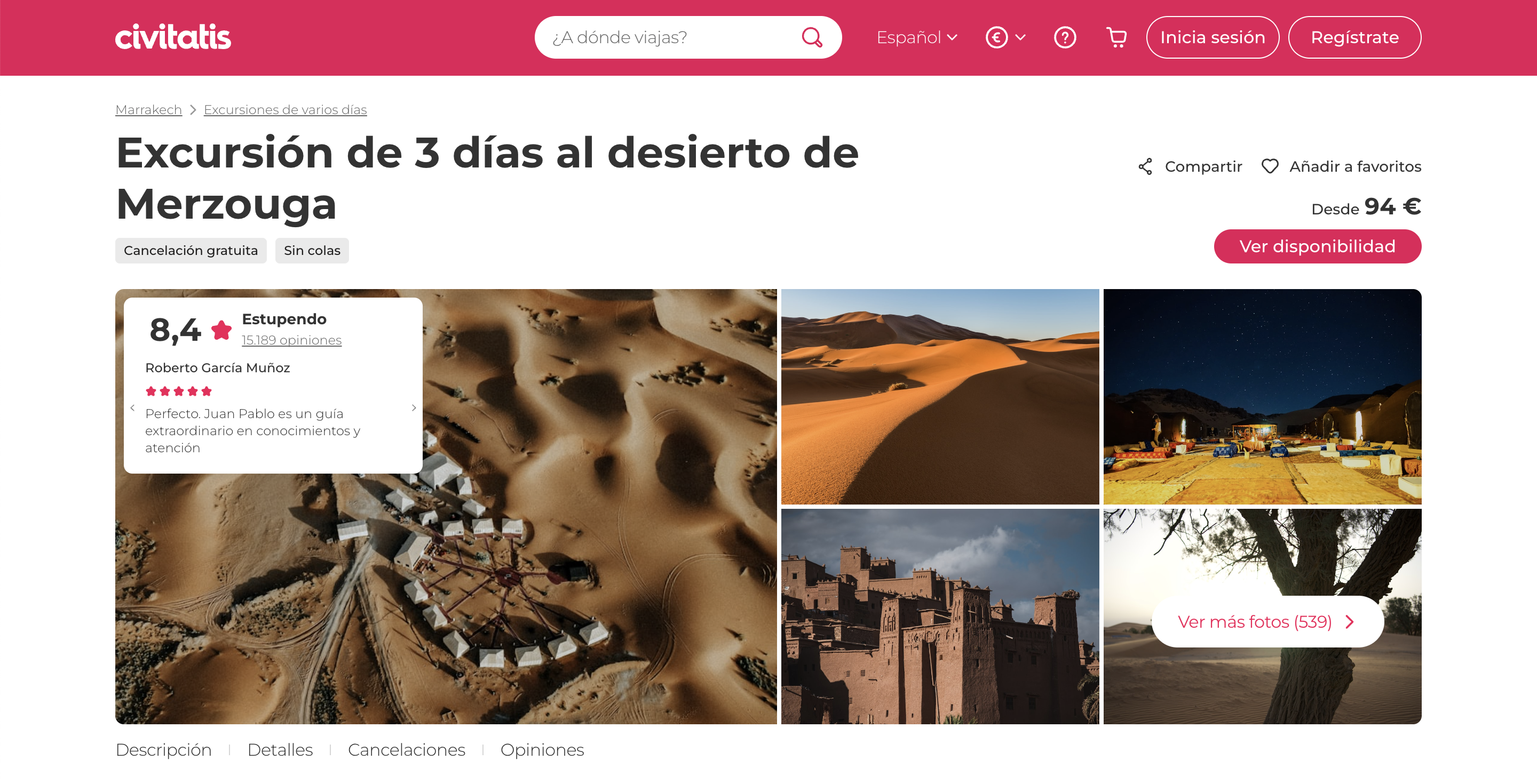
The PDP was the highest-traffic page after search, but session recordings showed users scrolling up and down repeatedly looking for basic information, price, duration, cancellation policy. The page structure buried critical details and created unnecessary cognitive load.
Key design decisions
- Product overview above the fold, rating, duration, free cancellation, and price visible without scrolling
- Mini description, concise summary replacing long-form text, designed for mobile scannability
- Restructured IA, clear sections: what's included, itinerary, meeting point, know before you go
- Behavioral mapping, social proof, urgency signals, and trust indicators placed at key decision points
pdp
Product detail page
Session recordings showed users scrolling repeatedly for price, duration, and cancellation policy. I moved the product overview above the fold, replaced long-form text with a scannable summary, and restructured the page around what users check before booking.
pdp-gallery


pdp-results
home-page
Home page
What the data showed
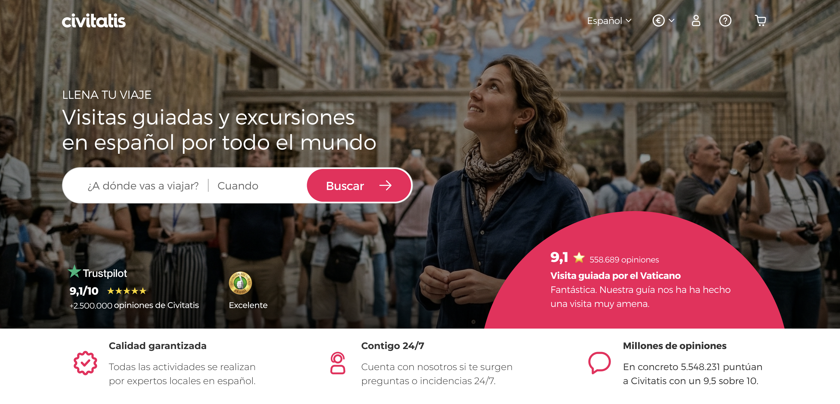
71.6% of traffic was mobile, but the homepage was designed desktop-first. Mobile users saw a desktop layout crammed into a small screen, no clear entry point into discovery.
Key design decisions
- Mobile-first discovery, redesigned the entry experience around how users actually browse on phones
- Aspirational imagery, real photography replacing stock, creating an emotional connection with destinations
- Modular structure, content blocks that adapt to different user segments and can be personalized
- Reduced cognitive load, clear hierarchy and scannable content replacing wall-of-text layouts
home-gallery


home-results
checkout
Checkout
What the data showed
21.7% of NPS complaints were payment-related, users worried about providing card data (especially for free tours), encountered technical failures, and wanted more payment methods. The checkout flow created anxiety at the exact moment it needed to build trust.
Key design decisions
- Security reassurance, visual trust signals (lock icons, secure payment messaging) prominent throughout the flow
- Field transparency, explaining why each form field is needed, reducing "why are you asking me this?" friction
- Purchase summary persistence, users always see what they're buying and the total, reducing back-navigation
- Anticipation messaging, "what happens next" content that reduces post-purchase uncertainty
checkout-gallery
Checkout visuals coming soon
home-+-checkout
Home page
Redesigned mobile-first with aspirational photography, modular content blocks, and clear hierarchy, 71.6% of traffic was mobile but the old homepage was desktop-first.
Checkout
Addressed the 21.7% payment-related NPS complaints with security reassurance, field transparency, persistent purchase summary, and anticipation messaging.
learnings-intro
What I learned
The redesign shipped in phases, the PDP changes were validated through the A/B testing program covered in the CRO & Experimentation case study.
learnings-grid
Surface symptoms almost always point to deeper structural problems, treating individual screens without understanding the system guarantees you'll redesign again.
Behavioral psychology gave the team a shared language for design decisions, "reduces uncertainty" is more actionable than "looks better."
NPS data was more valuable than any competitive benchmark, users were already telling us exactly what was wrong.
The hardest part wasn't the design, it was getting alignment on what to stop doing so we could focus.
A redesign without a clear diagnosis is just a reskin, the framework mattered more than the pixels.
contact