hero · design system
Odisea: from overengineered tokens to AI-powered design operations
I rebuilt a legacy token architecture from three layers to two, aligned it 1:1 with Tailwind, built the rules that let AI produce production-quality Figma components — then built the tool that puts those components directly in designers' hands.
specs
hero-visual
context
A growing company, a fragmented design language
Civitatis grew into a multi-platform company: B2C, B2B, and internal operations, built by 5 product teams in parallel. The visual language hadn't kept pace, web, iOS, and Android drifted apart.
A system existed in Figma and Storybook, but as a static library: disconnected from code, opaque token names, no governance.
The design system wasn't broken, it was never designed to scale with the company.
context
Civitatis grew into a multi-platform company, 5 product teams shipping to web, iOS, and Android, but the design system stayed a static Figma library: disconnected from code, opaque tokens, no governance.
the-problem
Over-engineered foundations, under-delivered components
The legacy system was built at the wrong abstraction level, harder to use than going without it.
Opaque token names
Names like sys-color-surface-container-highest required a lookup table. Designers avoided tokens altogether.
Massive duplication
Hundreds of tokens mapped to the same values, more tokens than design decisions.
Incomplete components
~15 components, most incomplete or out of sync with production code. Teams built one-offs instead.
No shared language
Figma didn't match CSS, which didn't match the documentation.
the-problem
The legacy token architecture was over-engineered: opaque sys-* names, hundreds of duplicated tokens, ~15 half-finished components, and no shared vocabulary between Figma and code.
evolution
Three years, three phases
- 2023: Research, Dan Mall courses, industry audits, governance models.
- 2024: Manual creation, token architecture, foundations, and first components built by hand, setting the quality bar.
- 2025–2026: AI pivot, everything I'd learned, encoded into skills, rules, and playbooks.
vision
A design system that speaks the same language as code
The goal: a system lean enough to be learnable, structured enough to be automatable, and aligned with the stack so designers and developers communicate without translation.
- Tailwind alignment: one vocabulary for Figma and code.
- Two token layers: primitives and semantics, nothing more.
- AI-ready rules: constraints that let AI create production-quality components.
- Cross-platform: one system for web, iOS, and Android.
vision
Build a system lean enough to be learnable, structured enough to be automatable, and aligned 1:1 with Tailwind, one vocabulary for Figma, code, and AI, across web, iOS, and Android.
token-architecture
From three layers of abstraction to two
The legacy model had three layers: reference → system → component tokens. The sys-* layer added complexity without clarity, so I collapsed it to two: primitives (raw values) and semantics (design decisions).
sys-color-surface-container-highest sys-color-on-surface-variant sys-typescale-body-medium-size bg-secondary text-muted text-base The Tailwind decision
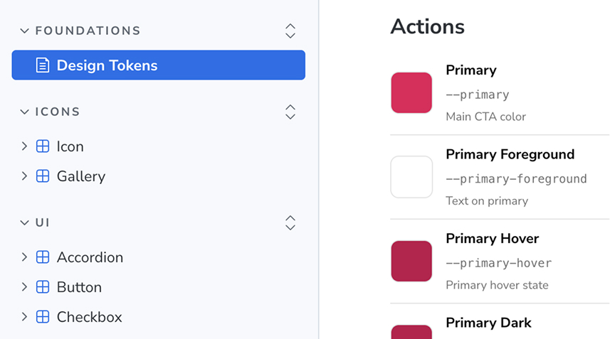
Matching token names to Tailwind utility classes eliminated an entire category of translation errors, rounded-lg in Figma is rounded-lg in code, and made the system natively legible to AI tools that already speak Tailwind.
token-architecture
I collapsed a three-layer token system (ref → sys → component) into two: primitives and semantics. sys-color-surface-container-highest became bg-secondary. Aligning tokens with Tailwind gave designers, developers, and AI tools one shared vocabulary.
adoption
Making adoption the easiest option
I started where inconsistency hurt most, booking flows and availability models. Early wins turned those teams into advocates who pulled the system into their own workflows.
Then I wrote the migration guides, contribution templates, and changelog that let teams adopt the system without me becoming a bottleneck. Five product teams now use it across web, iOS and Android; later teams onboarded through those guides and pairing sessions with early adopters.
adoption
I started where inconsistency hurt most, then wrote the migration guides, contribution templates, and changelog that let five product teams adopt the system across web, iOS and Android without me becoming a bottleneck.
foundations
Building the bedrock: typography, spacing, and systematic patterns
Every component inherits from a small set of constrained, purposeful scales.
The focus ring pattern
Accessibility was built in, not bolted on: one universal focus ring, same offset, color, and animation, shared by every interactive element. Keyboard accessibility came for free, and variant count dropped significantly.
Typography
A type scale from text-xs to text-5xl, mapped to Tailwind's defaults. Two families: display and body.
Spacing
space-1 through space-16, mirroring Tailwind's naming exactly, no semantic layer needed.
Border radius
rounded-sm to rounded-full, with semantic radius tokens mapped to specific UI contexts.
Colors
A curated palette of brand, feedback, and neutral tokens, each mapped to a semantic role.
Library architecture
I split the system into modular, scoped Figma libraries, each team consumes only what it needs.
Foundations
Tokens, scales, and base styles, the source of truth every library inherits from.
Icons
A unified icon set, versioned independently from components.
Components
Shared buttons, inputs, cards, and patterns used across all products.
B2C
Booking flows, search, and traveler-facing patterns.
B2B
Data tables, dashboards, and back-office patterns.
iOS
HIG-aligned controls and native patterns on Odisea tokens.
Android
Material-aligned components on Odisea foundations.
ai-workflow
Meta-design: I design the rules, AI executes within them
In 2025 I stopped building every component by hand. Now AI creates production-quality Figma components, within constraints I define.
I designed the quality contract, tokens, rules, and validation gates, so AI can now build components that pass the same bar I used to enforce by hand.
Four layers
Skills
Markdown files teaching AI the system's conventions: brand guidelines, token usage, Figma API patterns.
Rules
Typography, spacing, and color constraints the AI reads before every action.
Playbooks
Step-by-step procedures: creating a component, setting up variants, binding tokens, structuring auto-layout.
Validation gates
Checkpoints the AI must pass: token binding, naming conventions, auto-layout structure, accessibility compliance.
ai-workflow
In 2025 I built a four-layer system, skills, rules, playbooks, and validation gates, that lets AI create production-quality Figma components within constraints I define. I designed the quality contract; AI executes within it.
how-it-works
The “bind immediately” philosophy
Every value is bound to a token at creation, never retrofitted. AI doesn't set fill: #1a1a1a, it sets fill: bg-primary from the start, eliminating an entire class of drift.
components
Components in production
Shipped across web, iOS and Android, built on the token architecture and foundations above.
components
30+ production components shipped across three platforms, built on the token architecture and foundations above.
playground
Vibe coding with production-valid output
Once the system existed, the next problem was obvious: designers still sketched in Figma, handed off specs, and waited for a developer to turn them into real UI. Every step introduced translation loss.
The insight was simple: what if you could iterate through conversation with an AI — but using our actual components? Not something that looks like our DS. Our code. The output would be production-valid from the first prompt, because there’s nothing to correct.
I don’t make mockups anymore. I make working prototypes — in production-ready code, from the first prompt.
That’s what I designed and built with one developer: Odisea Playground.
Live preview
Components render as the AI edits them — no reload, no context switch. The designer sees changes the moment they’re written.
Point-and-tweak
Click any element to anchor the next request to it. “Give this button more padding” means exactly that button.
Saved designs
Name, tag, and search designs. Attach Jira URLs, export self-contained HTML, re-import later. ~380 designs and counting.
Hard guardrails
A Claude Code hook enforces that the AI only touches Preview.tsx. Nothing outside the design boundary is in scope.
5 designers use it today. The frontend of Civitatis Pro — a full B2B product — is being built by a designer in Playground, without a front-end developer.
playground
I designed Odisea Playground: vibe coding but using our actual DS components, so the AI’s output is production-valid from the first prompt. 5 designers use it; the frontend of a full B2B product is being built in it without a front-end developer.
the-proof
From a week to a day — directly to Optimizely
Before Playground, an A/B test required a designer to spec it in Figma, a developer to implement it, roadmap prioritization, and at minimum a week of coordination before anything went live.
After: the designer builds the variant in Playground, exports the HTML Optimizely requires, and launches the test the same day.
One home page redesign. Built in Playground, exported, live in Optimizely the same day.
No dev involved. No roadmap dependency. Design decisions now have a direct path to data.
the-proof
A/B testing went from a week to a day: designer builds the variant in Playground, exports HTML to Optimizely, launches the same day. A home page redesign yielded +4.9% searches and +10.38% re-engagement CTR — no developer, no roadmap dependency.
the-loop
When a design proves itself, it becomes a component
Playground wasn’t just an exploration tool. It became a feeder for the design system itself.
When a pattern proved valuable — used repeatedly, validated in production — I built a workflow to promote it back into @civitatis/ds-ui as a reusable component. The playground-to-ds skill handles the translation end-to-end:
Visual reference locked
The agent reads the Playground design — the exact render, not a screenshot — and extracts every invariant: geometry, spacing, typography, colors, interactions.
API designed first
The component’s public interface is decided before any JSX is written. The design is the constraint; the API is the variable.
Full DS integration
The component gets a colocated .doc.mjs, a Storybook story, and passes odisea-lint before any PR is opened.
Designer review in Storybook
The designer reviews the promoted component in local Storybook before the PR is opened. No shortcuts on fidelity.
The flywheel: explore in Playground → validate with data → ship to the system 15+ developers use.
the-loop
When a Playground design proves itself in production, playground-to-ds promotes it into @civitatis/ds-ui — locking the visual reference, designing the API first, adding docs and Storybook coverage. The flywheel: explore → validate → ship to the system 15+ developers use.
results
Impact across the organization
From a system no one used to the foundation of 6 products and a tool that puts production code in designers’ hands — in 6 months, with 2 people.
contact