Design System
Odisea: from overengineered tokens to AI-powered design operations
How I simplified a legacy token architecture, aligned it with Tailwind, and built a rule system that lets AI create production-quality Figma components — governed by the quality contract I designed.
A growing company, a fragmented design language
Civitatis grew from a single product into a multi-platform company serving B2C travelers, B2B partners, and internal operations — all built by 5 product teams working in parallel. The visual language hadn't kept pace: each team made local decisions, resulting in inconsistent experiences across web, iOS, and Android.
The existing design system lived in Figma and Storybook, but it served more as a static library than a shared language. Components were disconnected from code, token names were opaque, and there was no governance to keep things aligned as the product scaled.
The design system wasn't broken — it had simply never been designed to scale with the company.
Over-engineered foundations, under-delivered components
The legacy system had been built with good intentions but the wrong abstraction level. The token architecture used a deep sys-* naming convention that duplicated values, created confusion, and made the system harder to use than going without it.
Opaque token names
Names like sys-color-surface-container-highest required a lookup table to understand. Designers avoided using tokens altogether.
Massive duplication
Hundreds of tokens that mapped to the same values. The system had more tokens than design decisions.
Incomplete components
~15 components existed, most incomplete or out of sync with production code. Teams built one-offs instead.
No shared language
Designers and developers had no common vocabulary. Figma didn't match CSS, which didn't match the documentation.
A design system that speaks the same language as code
My vision was to build a design system that was lean enough to be learnable, structured enough to be automatable, and aligned with the technology stack so that designers and developers could communicate without translation.
- Tailwind alignment: token names that mirror utility classes —
text-sm,rounded-lg,space-4— so Figma and code use the same vocabulary. - Two-layer architecture: primitive tokens (the palette) and semantic tokens (the decisions) — nothing more.
- AI-ready governance: a rule system that enables AI tools to create production-quality components within defined constraints.
- Cross-platform coverage: one system serving web, iOS, and Android through shared foundations.
From three layers of abstraction to two
The legacy system used a three-layer model: reference → system → component tokens. The sys-* layer added complexity without adding clarity. I collapsed it into a simpler two-layer system: primitives (raw values) and semantics (design decisions).
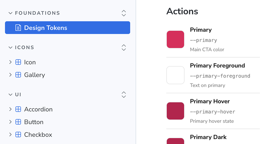
sys-color-surface-container-highest sys-color-on-surface-variant sys-typescale-body-medium-size bg-secondary text-muted text-base The Tailwind decision
Aligning with Tailwind wasn't just about naming — it was a strategic choice. With Tailwind as the CSS framework, matching token names to utility classes eliminated an entire category of translation errors. A designer writing rounded-lg in Figma produces exactly the same output a developer writes in code.
This decision reduced onboarding friction for new team members, simplified code reviews, and — critically — made the system legible to AI tools that already understood Tailwind conventions.
I collapsed a three-layer token system (ref → sys → component) into two layers: primitives and semantics. Names like sys-color-surface-container-highest became bg-secondary. By aligning tokens with Tailwind utility classes, designers and developers shared the same vocabulary — and AI tools could understand it natively.
Building the bedrock: typography, spacing, and systematic patterns
With the token architecture defined, I built the foundational scales that every component would inherit. Each scale follows a constrained, purposeful progression.
The focus ring pattern
Accessibility was built into the foundations, not bolted on. I designed a universal focus ring system that works across all interactive elements — buttons, inputs, links, cards — using a consistent offset, color, and animation pattern. By treating focus as a shared style rather than a per-component variant, every interactive component got keyboard accessibility for free, and the total variant count dropped significantly.
Typography
A type scale from text-xs to text-5xl, mapped to Tailwind's default scale. Two font families: one for UI (display), one for body text.
Spacing
Tokens mirror Tailwind's naming exactly — space-1 through space-16 — no semantic layer needed. One shared vocabulary for designers and developers.
Border radius
A radius scale from rounded-sm to rounded-full. Components use semantic radius tokens that map to specific UI contexts.
Colors
A curated palette of brand, feedback, and neutral tokens. Each color maps to a semantic role used consistently across all surfaces.
Library architecture
With the token system in place, I structured the design system into dedicated Figma libraries — modular, scoped, and optimized for performance. Each team consumes only what they need.
Foundations
Tokens, scales, and base styles. The single source of truth every other library inherits from.
Icons
A unified icon set published as a standalone library, versioned independently from components.
Components
The shared component library — buttons, inputs, cards, and patterns used across all products.
B2C
Consumer-facing components: booking flows, search, and traveler-oriented patterns.
B2B
Back-office components: data tables, dashboards, and admin-specific patterns.
iOS
Native iOS patterns adapted to Odisea tokens — navigation bars, sheets, and HIG-aligned controls.
Android
Material-aligned components built on Odisea foundations — bottom sheets, FABs, and system dialogs.
Meta-design: I design the rules, AI executes within them
In 2025, I made a strategic pivot. Instead of manually creating every component, I built a system where AI could create production-quality Figma components — but only within the constraints I defined. This wasn't about replacing design work. It was about designing at a higher level of abstraction.
I don't design components anymore. I design the quality contract that governs how components get made.
The system has four layers
Skills
Markdown files that teach AI the design system's conventions: brand guidelines, token usage, component patterns, Figma API patterns.
Rules
Constraints that define what's allowed and what isn't. Typography rules, spacing rules, color usage rules. The AI reads these before every action.
Playbooks
Step-by-step procedures for complex operations: creating a component from scratch, setting up variants, binding tokens, structuring auto-layout.
Validation gates
Quality checkpoints the AI must pass: token binding verification, naming convention checks, auto-layout structure validation, accessibility compliance.
The “bind immediately” philosophy
A core principle: every value must be bound to a token at the moment of creation, not retrofitted later. When AI creates a rectangle, it doesn't set fill: #1a1a1a and fix it later. It sets fill: bg-primary from the start. This eliminates an entire class of drift.
The process arc
The system evolved over three years:
- 2023: Research phase. Dan Mall courses, industry audits, governance models. Understanding what a design system needed to be at Civitatis's scale.
- 2024: Manual creation. Building the token architecture, foundations, and first components by hand. Establishing the quality bar.
- 2025–2026: AI-powered pivot. Encoding everything I'd learned into skills, rules, and playbooks. Shifting from creating components to governing their creation.
Measurable impact across the organization
The transformation produced tangible results across design operations, development velocity, and cross-platform consistency.
Variant reduction through consolidation
Faster component creation with AI
Production components
Token reduction
Platforms served (Web, iOS, Android)
Product teams using the system
Get in touch
Let's talk.
Open to new opportunities. Based in Madrid, working globally.