
02 / 03
Shana
A brand that breathes.
Shâna is a meditation school created by Dana, with regular classes, workshops, one-to-one sessions and online practice. The project started from zero — naming, visual identity, an animated icon system and the website — all built around a single idea.
That idea is breath. The symbol, a circle of particles, expands and contracts at the pace of a resting inhale and exhale. The icons draw themselves with the same calm. Even the palette splits in two: Aire above, Tierra below.
- Naming
- Brand identity
- Iconography
- Motion
- Web design
- SEO strategy
The brief
Where it started
Dana was launching a meditation school with a very small audience, a very personal teaching style, and no brand equity. Meditation as a category was already crowded — pale gradients, generic zen photography, look-alike sans-serifs. Shâna needed a brand that felt like her practice: quiet, unhurried, credible without being clinical.
The brief was a full identity system and a live website — recognisable, coherent across print and screen, and searchable enough for a new school to be found in its city.
- Starting point No name, no visual language, no digital presence.
- Category Established schools already owned the obvious keywords.
- Team Solo build. One designer, one founder.
- Context 2020 — online practice suddenly mattered as much as in-person.
01
A name born from Shanti

The name grows out of Shanti, the Sanskrit word for peace, chanted at the close of countless meditation sessions. Softened and shortened, it becomes Shâna: the same quiet, with a rhythm of its own. The circumflex turns the â into a small roof, a shelter, a breath mark drawn above the letter. Repeated slowly, Shâna works like a mantra in its own right.
02
An SEO-first domain
clasesde
The brand name and the domain didn't have to match, so before naming anything I went looking for the domain. Keyword research in Spanish pointed straight to clasesdemeditacion.com: an exact match for what people actually type into Google, with none of the established meditation schools already owning it. The brand does the remembering; the domain does the ranking.
03
A logo that breathes

The symbol is a circle of particles that never sits still: it expands and contracts at the pace of a resting breath, the same rhythm you settle into when you close your eyes to meditate. It's identity as instruction: look at it long enough and you start breathing with it.
04
Construction & clear space
The lockup is built on a modular unit — x — the height of the lowercase 'a' in the wordmark. That single measure fixes the proportion between symbol and wordmark, the gap that holds them apart, and the breathing room around the whole mark.


- Bounding box of each element
- Clear space and internal gap — always one x
- Proportion — symbol is 3x, wordmark is x
80 px Recommended 32 px Minimum 40 mm Recommended 15 mm Minimum 05
Icons that draw themselves
Four hand-drawn icons, one per service. Each draws itself in a single continuous line, at the same calm pace as the rest of the system.
06
Two typefaces, one voice
Ââ
abcdefghijklmnñopqrstuvwxyz
ABCDEFGHIJKLMNÑOPQRSTUVWXYZ
1234567890 ¿?¡! () @ & %
El camino del bienestar
Alverata Display serif · headlines and voice · live type
Ââ
abcdefghijklmnñopqrstuvwxyz
ABCDEFGHIJKLMNÑOPQRSTUVWXYZ
1234567890 ¿?¡! () @ & %
El camino del bienestar
Krub Humanist sans · interface and reading · live type
07
One color to breathe with
- Aire Aire #7CDADA
- Tierra Bosque #004B47
- Tierra Carbón #2C3031
- Tierra Madera #6A4204
- Tierra Arena #F0C895
One color to breathe with and four to stand on. Aire carries the symbol and every accent; Tierra grounds the site, the type and the photography in Bosque, Carbón, Madera and Arena.
08
The brand on paper
Respira. Clases de meditación presenciales y online, cada semana. clasesdemeditacion.com Martes y jueves · 19:30 h
Sábados · 10:00 h Primera clase gratis clasesdemeditacion.com
El camino del bienestar  Vuelve
a ti. Sesiones personales de meditación, presenciales y online. clasesdemeditacion.com
respirar Un sábado al mes · 10:00 h
Plazas limitadas
Todos los niveles Reserva tu plaza clasesdemeditacion.com
 El camino del bienestar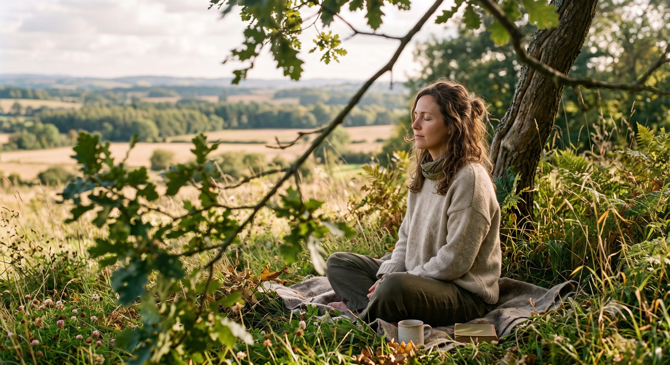
el camino Retiros de meditación en plena naturaleza. clasesdemeditacion.com

a ti. Primera clase gratis
09
The website
A calm, single-scroll site where the brand does the talking: the symbol breathes over the hero, the icons draw themselves as the services appear, and the type sets the pace of the reading.

Estás en casa. Clases de meditación presenciales y online para volver a ti, a cualquier hora del día. Empieza gratis Conoce a Dana
 Clases regulares
  Talleres
  Sesiones personales
  Clases online
 Estás en casa. Clases de meditación presenciales y online. Empieza gratis
Clases regulares Talleres Sesiones personales Clases online 10
The moment after the exhale
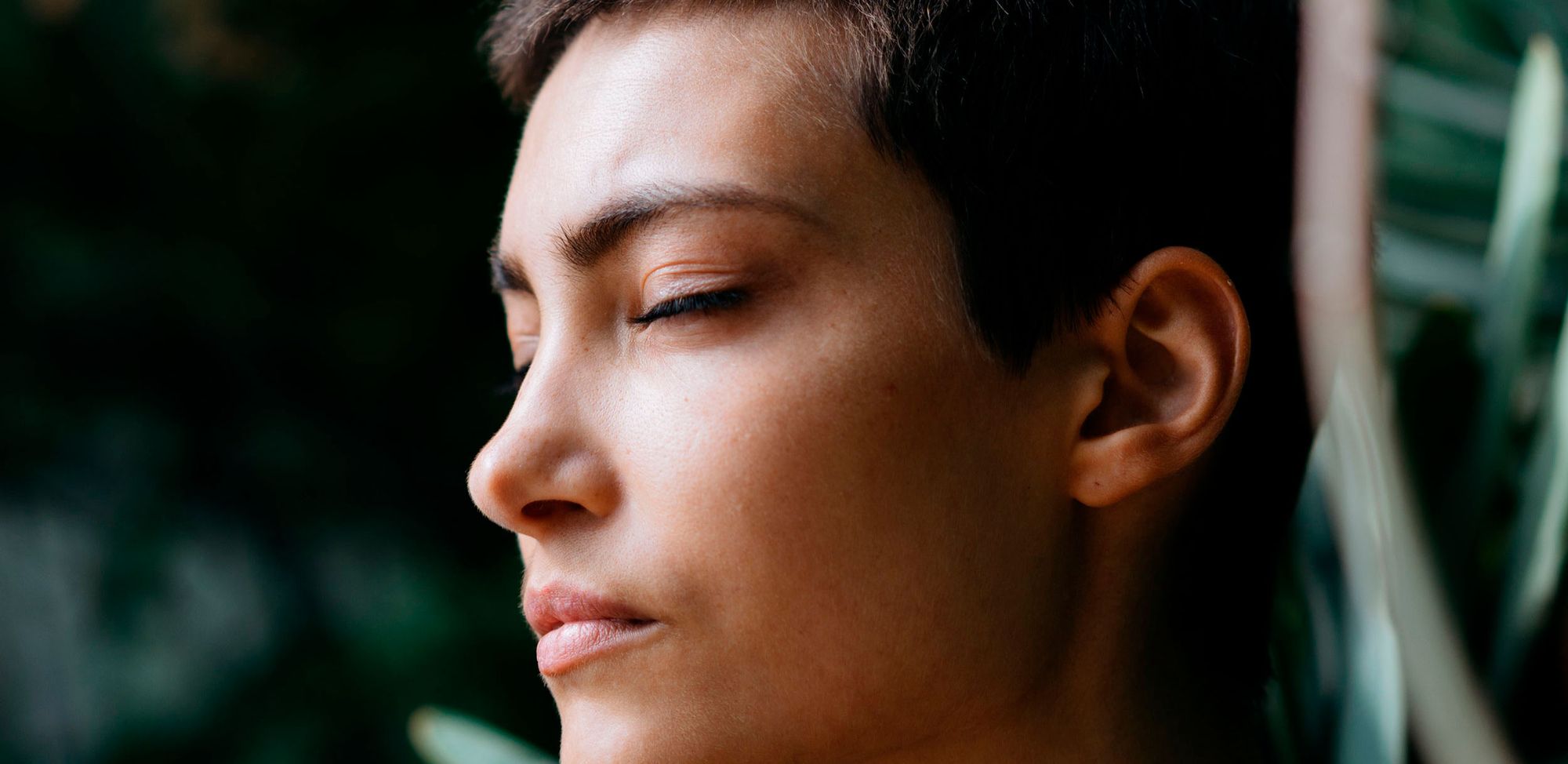
Real people, closed eyes, natural light filtered through plants. No lotus-pose stock, no incense clichés — just the stillness that comes when the body finally lets go.
Reflections
Five years on
What worked
- Designing name, symbol and motion as one problem locked the metaphor early. Everything downstream got easier.
- The two-family palette — Aire and Tierra — gave the brand more range than a single accent would have. Five years on, it still holds.
- Trading brand vanity for SEO on the domain was the right call for a small school with no marketing budget.
What I’d do differently
- Instrument the site from day one. In 2020 I shipped without proper event tracking. Today I’d wire analytics so we could see which pages actually drive bookings.
- Package the motion as a portable asset. Today I’d export the breathing symbol as a standalone Lottie so Dana could reuse it on Instagram or YouTube without me.
- Write a two-page brand memo instead of a full guide. A one-person business needed a “how to keep this coherent” doc, not a brand book.